I made up my mind. I'd like to use the new BG for Narcolepsy.
YOUR THROBBING MULTIFARIOUS LUSTFUL DESIRES ARE COMPLETED N YOUR HYPER-ORANGE SELF, YOU MAKE ME LOVE AGAIN, YOU'VE CHANGED MY HEART, MY MELANCHOLIA DISAPPEARS WHEN YOU ARE INSIDE OF ME, MY HUMAN RAGE IS TEMPERED WHEN I AM INSIDE YOU, THE SECRET IS COMMUNICATION, LONGEVITY, STAMINA, REPETITION, FURY, SOULFUL KISSING, EARPLUGS. YOU FUCKING CORPORATE COCKS AND CUNTS.
MY ANXIETY COMPLETE, MY DESIRE REPLETE, THE TASTE OF ORANGE BLOOD AND CUM AND GREENBACKS RUNNING DOWN MY FACE. THE STREETS WILL RUN ORANGE WITH YOUR MIXTURE OF CHEETOS AND HUNDRED DOLLAR BILLS REGURGITATED AND EATEN AND SHIT OUT AGAIN AND EATEN AGAIN.
YOU ARE MY SCULPTURE, MY SCULPTRA, MY SELF-DEFINITION. MY DEFINITION OF HUMANITY, MY HARMONY. MY HEART AND MY MIND.
YOU ARE SO ORANGE. SO CRUNCHY. SO CONSUMABLE.
THE NEW ORANGE UNDERGROUND IS THE ORANGE UP MY ASS. AND YOUR ASS.
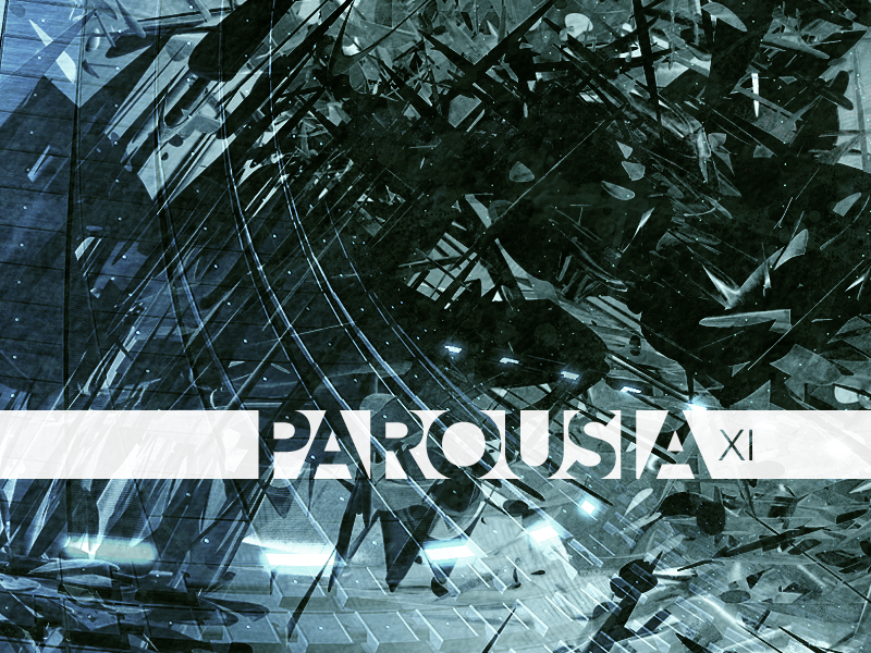
Why did you make it so dark yoshl? It's making all the colors muddy..
Please just avoid super high contrast / 100% white / 100% black unless it's absolutely warranted (which most of the time it isn't) or it's a pure graphical style choice (no, that doesn't mean the way you use it is a style choice). It makes for such ugly backgrounds because it muds out any interesting color scheme and becomes very distracting to look at..
oh right btw the pack needs a new banner that says ODIPack3 and not ODI PACK3 (ODIPack3 or ODIPack 3 is fine). i almost forgot about, bugged people about it a few times months ago but it didn't happen =P
let's hope tomorrow is the big day when the pack is finished guys ;D!! thanks so much for your work
Why did you make it so dark yoshl? It's making all the colors muddy..
Please just avoid super high contrast / 100% white / 100% black unless it's absolutely warranted (which most of the time it isn't) or it's a pure graphical style choice (no, that doesn't mean the way you use it is a style choice). It makes for such ugly backgrounds because it muds out any interesting color scheme and becomes very distracting to look at..
thanks, will keep that in mind~
and you're right, lol it looks alot...better :P (lmfao somehow the quality got raped)
re-hosted through dropbox not imgayr, which is a kind of gay
I like it but the spacing on "Space" is really all over the place, especially in the background. Also you could try something more with the black text to make it fit more with the other text. I know you chose to make it black in the bg because of the white of the space key but I think you could do something more fancy with it. Lastly, bump it down a bit so it's vertically evenly spaced on the space key because it's nearly touching the top right now (bad thing to do! Either go over it (which would be silly in this case) or go under it more, not half/half. Consistency!).
edit: It's like you completely ignore what I said lmfao. It looks much worse atm..


Comment