It's hard to make it look really good with Cirno. No matter how well you execute the graphics, it'll always be downgraded by pictures of Cirno because you're stuck in animu style because of it lol
spitfire,sorry 2 have to do this 2 u but 4 this post i will have 2 ban u from ffr sorry really sorry but iu think this is a justified ban
Yeah, I was a little worried you guys wouldn't like it. It's very upbeat, but just going with diluted colors cause of it's samples seems to detract from the song. :/
I'm just gonna pump a few of these out. Won't be saving anything and I'm pretty shit, so feel free to replace if you want to.
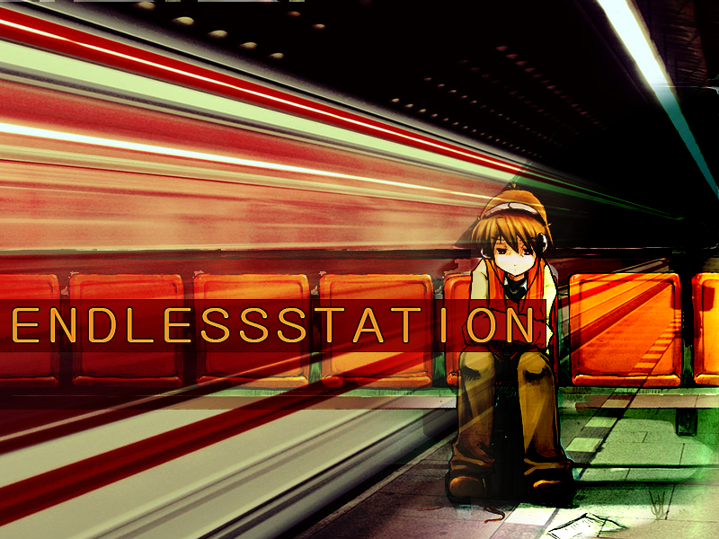
edit: lawl just noticed the banner text looks wayyyy better than the bg text. oops. did a shoddy update.
also just noticed you guys are using slightly different resolutions than the ones I'm used to. guess those are standard now? I'll just ape what you're doing.
Yeah, I was a little worried you guys wouldn't like it. It's very upbeat, but just going with diluted colors cause of it's samples seems to detract from the song. :/
Anyways, here's the gfx joel wanted fixed up.
the text is cool. i suck at gfx but i thought i had a pretty nice idea, here's the original psd if anyone else wants to try something with it
Since the one i made isnt that great acording to the standards of the ones you people made.
Pretty much the idea i had is to include 2 backgrounds for it and do a transition in the "climatic" end (like we met dat night from kbc3), first one should be darker, grayer version (without any caption), and the other one should be more a lot more vivid:


Comment