Lot of time put into these... I can't do any more right now because my lap top is dead. :[ Hope you like them... Only Flame fractal is in any of them, so nobody say somethign stupid about fractal overuse.
Originally posted by darkshark
Everyone sucks at this game. The second you think you're good is the second you stop trying to get better.
Originally posted by aperson
i had a mri the other day it was the best song i heard in years
Originally posted by Sprite-
More of a joke than the time I deleted all the credits on the site.
Originally posted by MinaciousGrace
yeah my goldfish think im a riot they do this thing where they turn upside down and float to the top of the tank
i guess their alcohol tolerance isnt as high as mine
They are alright, nothing too special. There's a few cool effects a flare here and there that's alright. Font is kinda flashy, but nothing that really stands out as something really out of the ordinary.
I don't know where you started from, but if they're an improvement then good job, and keep up the good work.
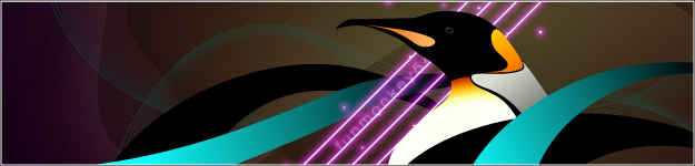
I like Justin's and Mitch's the best, Justin's first, too. The EJ one is mine, as that's me. Kaitlynn is my girlfriend, who's a major burn out, so I jope she likes that one. Felicia and Emily are her friends. The others were requests from people. Also, I take requests.
And thank you. The font is really just different Cryllic and Arabic and Hebrew stuff and other symbols in Charmap (most usefull thing, like, ever)! If you look at my previous gfx threads I think I've really improved, but I wanted some feedback and thank you, thus far.
Originally posted by darkshark
Everyone sucks at this game. The second you think you're good is the second you stop trying to get better.
Originally posted by aperson
i had a mri the other day it was the best song i heard in years
Originally posted by Sprite-
More of a joke than the time I deleted all the credits on the site.
Originally posted by MinaciousGrace
yeah my goldfish think im a riot they do this thing where they turn upside down and float to the top of the tank
i guess their alcohol tolerance isnt as high as mine
You need to stop doing drugs rzr. Or at least cut off your ear and give it to your girlfriend. I hear that makes you a rich and famous artist, but only after you die.
fractal overuse has nothing to do with how many different one you use.
more with how you use it.
I found that effort, although nice, has absolutely nothing to do with if something is good.
(I hope it did)
heres some stuff you might wanna consider/change
font (said too many times by others, i guess one more wont hurt xD )
don't do so many layer effects for text (assuming this is photoshop)
coherency, you lack it.
neatness, i am not talking about lining everything up, just don't make it so someone would think the pictures looks dirty.
the fractals, they have no relationship to the other stuff you put there (text), it kills everything basically
anyway, my advice, try simple things, don't just put whatever you can put, and stick with simple looking things. Stay away from heavy filters.
edit:
sry to burst your bubble, but , char. map, don't use it much..it doesn't do much good to making a picture look 'whole'.
and lens flare effect don't use them in a sig unless you are ABSOLUTELY sure what you are doing.
the only place i would EVER use lens flare is in a bright theme'd picture, most likely at the sun, and even then i wouldn't use a high opacity one.
this may sound gay(politically incorrect) but,
any form of art, there is a theme to it, i don't care if its sig, painting or sketch. find a theme stick with it, and you will less likely find yourself astray (putting random stuff in)
I call it composition, different people call it different things.
Font. It is the main focus of the picture, as it is supposed to be, I say you did a good job at that, because I really.....really....really hate people who make a signature that has their name blend in with the background....it defeats the entire point of it. BUT It should still flow well with the background, like Renevatia said, it lacks the coherency in the backgrounds. Making backgrounds that look cool doesn't cut it these days, take the time and create things that flow, this is a work of art, treat it like one.
Also....huge overuse on the bright stuff on the text.....at the very least make it a contrasting color with the background, not the same color in every single image.
Hmmm.
Use this font and affects you have been, but try it against a completely black background. Then add diagonal facing bars that spread across one corner, but make them the same silver and cyan color and affect your font has. Simple, but it would look pretty cool and make the font stand out in the effect I think you were aiming for.
Also....huge overuse on the bright stuff on the text...
This is mostly what I saw. The flow of your images could use work, and renviata's notes on 'composition' are also worth taking into account, but some of them employ more professional-looking effects, and they all look pretty good.
AAAs: 210 (186+7+17)
Best AAAs: Vertex BETA, Fighting for Control, Nova Pulser
Recent AAAs: {Firestorm}, Dazzling Destiny, Hellbeat v2p 2nd place in 3rd Official Tournament
1st place in Jugglin/Jteh's 1st Tournament


Comment