Re: Halloween Contests
Nice read. 
What about last Yoshl entry ? The hurricane one ?
Alright guys, time for me to figure out the winners of the banner contest. For now here's my thoughts on them. I will probably deliberate with a person or two on the top three. Stay tuned!
Let me start by saying I think you all did a nice job and this is a tough decision to make. I'm going to give little notes on each banner here and choose the winners from there.
MrPreggers

While I can certainly appreciate this (being a King of the Hill lover myself) and I do think it's a fun entry, unfortunately it's just too distorted. You can't really read flashflashrevolution at all and the images are quite jagged.
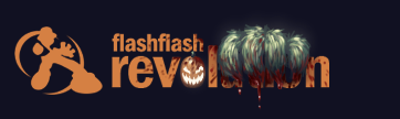
Yoshl

I love this. I think this is great for Halloween because it's dark and ominous. I love the eyes staring at you from behind the flashflash revolution logo. The colors work perfectly for Halloween as well.
Arntonach
I think this was very well done, and there certainly is beauty in simplicity, but it doesn't really say Halloween to me. Yes it has the orange color, but I'm just not quite getting that Halloween vibe from it.
foxfire667

This is really cute, I really liked that you turned the FFR Guy into a ghost. I thought that was very creative. I think what takes me back from this a little is that it's more cartoony and doesn't give that Halloween fright feel that I'd like to see.
chez-the-guy

I like this banner a lot, like YOSHl's it gives that dark ominous feel. I do notice some jaggedness in the image though around the ffr guy and the text. But overall a solid submission.

This I loved, Slenderman is scaring people all over right now. So it's definitely with the time and will give people that fright feel. The jaggedness works in this banner since slenderman makes everything go crazy when you look at him.
!!!!

I really love the candy corn arrows, very cute and creative idea. The problem is, you really can't read the text at all. Unfortunately that's really a kicker here.

Again a really neat concept, but the text is unreadable.
PrawnSkunk

I do like this image, but this just gives me more of a fall feel than it does a Halloween feel. I could actually see this being used as a Thanksgiving image.

Now this one is more what I'm looking for. I like the creepy face and the colors you used. The no sleep edition was a nice little touch as well. Overall pretty well done, the text is still legible even though it has some little chunks taken out for your design. For some reason this one is giving me kind of a silent hill feel.
Pseudo Enigma

Cute idea with the fleshflesh revolution. This banner is definitely well done, clean. But again it's one that's not really giving me that Halloween feel. I think a big part of it is the purple background color and the Jack-o-lantern is just very happy looking.
Mahjix
This one is definitely a cool idea and very well done in terms of execution. I love the evil Jack-o-lantern for the o. The issue is, you cover up part of the name :/ We really still need to be able to see it enough. There was also something that was irking me about this that I couldn't quite put my finger on, I think it may be the colors of the banner.
Mollocephalus

Definitely feeling this one. I like how you turned the FFR guy into Freddie. The background design works great. The only thing I'm a little iffy on is the text.

Definitely nicely done execution wise. But it's not quite what I'm looking for when it comes to Halloween.
Let me start by saying I think you all did a nice job and this is a tough decision to make. I'm going to give little notes on each banner here and choose the winners from there.
MrPreggers
While I can certainly appreciate this (being a King of the Hill lover myself) and I do think it's a fun entry, unfortunately it's just too distorted. You can't really read flashflashrevolution at all and the images are quite jagged.
Yoshl
I love this. I think this is great for Halloween because it's dark and ominous. I love the eyes staring at you from behind the flashflash revolution logo. The colors work perfectly for Halloween as well.
Arntonach
I think this was very well done, and there certainly is beauty in simplicity, but it doesn't really say Halloween to me. Yes it has the orange color, but I'm just not quite getting that Halloween vibe from it.
foxfire667
This is really cute, I really liked that you turned the FFR Guy into a ghost. I thought that was very creative. I think what takes me back from this a little is that it's more cartoony and doesn't give that Halloween fright feel that I'd like to see.
chez-the-guy
I like this banner a lot, like YOSHl's it gives that dark ominous feel. I do notice some jaggedness in the image though around the ffr guy and the text. But overall a solid submission.
This I loved, Slenderman is scaring people all over right now. So it's definitely with the time and will give people that fright feel. The jaggedness works in this banner since slenderman makes everything go crazy when you look at him.
!!!!
I really love the candy corn arrows, very cute and creative idea. The problem is, you really can't read the text at all. Unfortunately that's really a kicker here.
Again a really neat concept, but the text is unreadable.
PrawnSkunk
I do like this image, but this just gives me more of a fall feel than it does a Halloween feel. I could actually see this being used as a Thanksgiving image.
Now this one is more what I'm looking for. I like the creepy face and the colors you used. The no sleep edition was a nice little touch as well. Overall pretty well done, the text is still legible even though it has some little chunks taken out for your design. For some reason this one is giving me kind of a silent hill feel.
Pseudo Enigma
Cute idea with the fleshflesh revolution. This banner is definitely well done, clean. But again it's one that's not really giving me that Halloween feel. I think a big part of it is the purple background color and the Jack-o-lantern is just very happy looking.
Mahjix
This one is definitely a cool idea and very well done in terms of execution. I love the evil Jack-o-lantern for the o. The issue is, you cover up part of the name :/ We really still need to be able to see it enough. There was also something that was irking me about this that I couldn't quite put my finger on, I think it may be the colors of the banner.
Mollocephalus
Definitely feeling this one. I like how you turned the FFR guy into Freddie. The background design works great. The only thing I'm a little iffy on is the text.
Definitely nicely done execution wise. But it's not quite what I'm looking for when it comes to Halloween.
What about last Yoshl entry ? The hurricane one ?


Comment